
🔥 Relatable App Update Meme Format
Create viral content about frustrating app changes everyone experiences.
It’s the digital equivalent of someone rearranging your kitchen in the night. Let’s talk about why these “improvements” often miss the mark and what it says about how we really use our favorite apps.
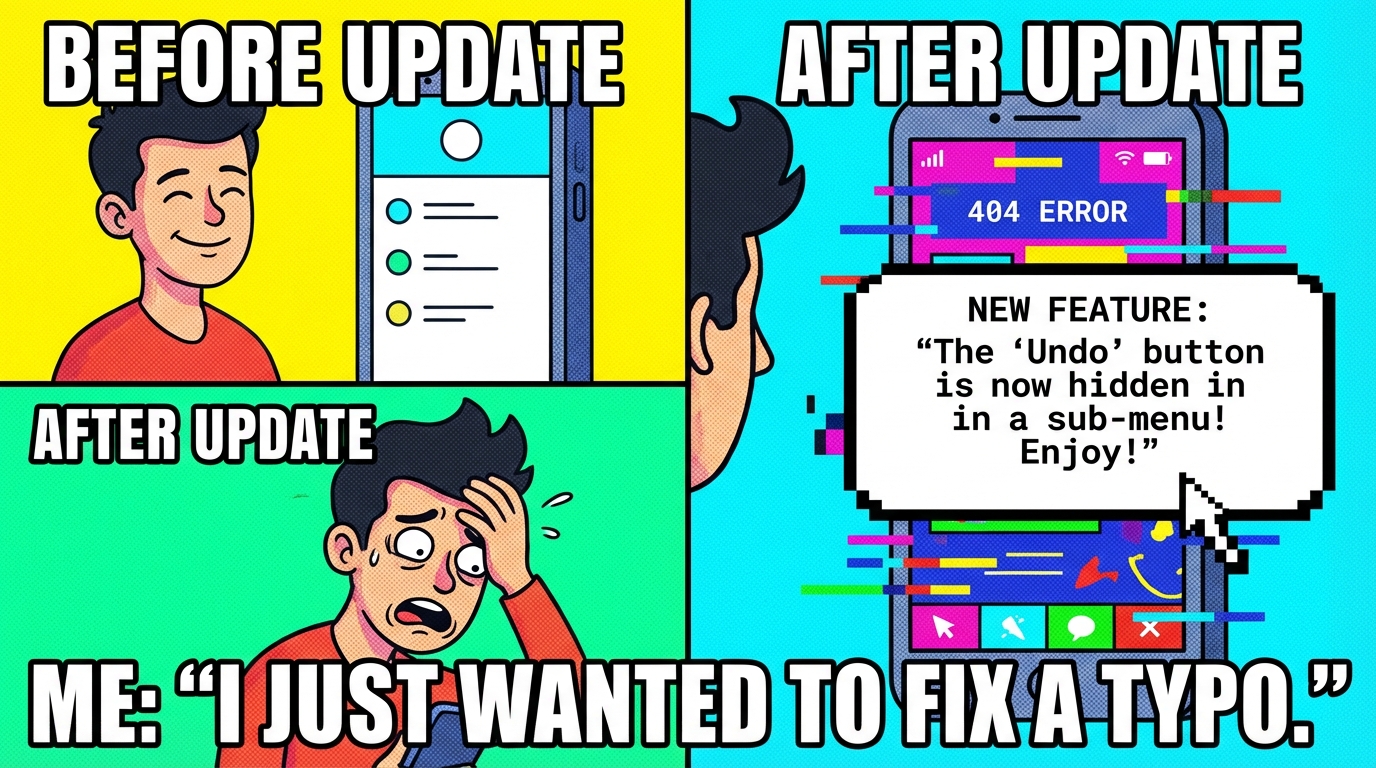
Ever update an app and suddenly feel like you’ve been digitally gaslit? You go to tap your favorite button, and it’s just… gone. Replaced by a confusing icon or buried in a menu you didn’t know existed. Welcome to the latest collective groan online: Feature Updates Gone Wrong.
This isn’t just about mild annoyance. It’s about the universal experience of opening an app you’ve used for years and feeling like a tourist in your own home. The Reddit hive mind is buzzing with over 500 upvotes of pure, shared frustration, cataloging every time a company “fixed” something that was never broken.
There’s a special kind of comedy in the sheer confidence of these updates. Some designer somewhere presented a sleek, minimalist button that does seven things at once, and a whole team nodded along. Meanwhile, the actual users are left trying to find the “post” button like it’s a hidden object game. It’s the digital equivalent of someone rearranging your kitchen while you sleep and then acting surprised you can’t find the coffee.
The funniest part is the predictable cycle. First, confusion. Then, outrage. Then, the frantic search for an “old version” APK or a buried setting called “classic view.” We become digital archaeologists, desperately digging for the past. It proves that for all our love of innovation, what we truly crave is a “undo update” button for life.
So next time an app transforms overnight, remember you’re not alone. We’re all just out here, collectively squinting at our screens, wondering who asked for this and if they’re okay. The real viral trend isn’t the update itself—it’s the shared, sighing solidarity in the comment section. Now, if you’ll excuse me, I have to go through three submenus just to log out.
Quick Summary
- What: This article explores frustrating app updates that remove or hide familiar features.
- Impact: These confusing changes waste user time and create widespread digital frustration.
- For You: You'll learn why updates fail and how to navigate them better.


💬 Discussion
Add a Comment